Everyone remember LOST? What a great show that was. Coherent narrative, simple and relatable characters, and a supremely satisfying and well-explained ending. I loved LOST, and I loved the fact that it didn’t push envelopes or challenge its audience in any way.
In a similar vein, I’m really liking MIND MGMT. It’s got a similar streamlined structure with characters that are instant classics and a narrative that, while at times a bit predictable, is absorbing and safe while providing a lot of comfortable familiarity.
If only.
I’m the first one to admit that I generally prefer complex, overly-complicated stories when compared to bog-standard, audience appeasement pieces with limited characters and a plot that could be completely outlined on a piece of toilet paper. I can get into schlock-fests like The Expendables and Armageddon every so often, but if my mind-cogs aren’t stimulated by something with at least six analytical reference books’ worth of subtext then I feel like it’s a wasted effort on my part. If there’s one thing MIND MGMT provides in spades, it’s stimulation – for better or worse.
In a present-day setting where there are as many psychically-gifted individuals as there are abortion-hating Republicans, a young writer living a Bohemian lifestyle abroad ends up discovering the existence of MIND MGMT, an organisation dedicated to “recruiting” (read: kidnapping) those with extrasensory talents and putting them on the government payroll. This shady conglomerate of ESP’ers are used as hitmen, data entry operators and creative visual artists (no, seriously) by the United States, for the main purpose of…something nebulous. Our young writer protagonist is recruited by a guy who knows here from…somewhere, and wants her to help him bring down MIND MGMT because…he really wants to bring them down. Oh, and there are two Croup and Vandermar-esque psychic hitmen after them both because…uh, they really want to kill them.

While I’m damn sure I’m going to recommend MIND MGMT, it needs to come with an overweight asterisk and a reader’s guideline attached: do not read this if you’re expecting easy answers, or any answers at all for that matter. There’s plenty that is followed up on (such as some of the nebulous actions of the agency, which begin to paint a literal and figurative picture of a government conspiracy that’s waaaaaay over on the amoral side of the scales) but there’s a whole lot that isn’t, with the narrative barrelling along without pausing for resolution and taking audience understanding as read. Granted, some of that can be forgiven because this is Volume 1 of a multi-part story, but there’s a lot that can’t. The true nature behind Meru, the writer protagonist, and the dude helping her is kinda explained but not entirely, and the motivations of the two hitmen after them are also summarily left mostly to reader imagination to fill in the blanks. While that’s not necessarily a bad thing for a story, merely raising the enigmatic elements and making me wait impatiently for the next volume to give me more half-answers, it’s very much a love-it-or-hate-it kind of deal.
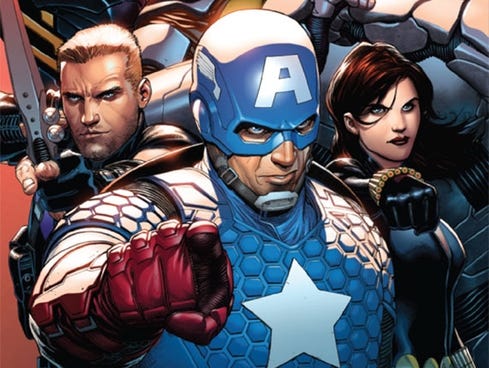
Similarly attached to the polarizing story is the artwork, hand-drawn by writer Matt Kindt. Remember a few weeks ago in my  Thor review when I mentioned loving artists who illustrate rather than straight-out CGI their comics? Well, there are times when this kind of artistic freedom can result in visuals that get a little too into themselves. For example, the pages themselves are done in a kind of crayon-cum-Picasso style that at times more resembles a primary schoolkid’s attempt at art than any actual illustration. On top of that, there’s a distinct lack of big visual codifiers for most of the characters to be distinguished against each other – part of where a series like The Walking Dead excels in delineating different characters, without the useful superhero aid of different coloured costumes, is through little facial and clothing details that tell us immediately who we’re looking at without going to great extremes (for example, a scar and some freckles distinctly tell us Andrea is talking, rather than her carbon-copy facial doppelganger in the Alexandria Safe Zone who’s a completely different character).
MIND MGMT has a problem where, especially in the opening chapter during a riot in Zanzibar, character distinction is difficult. We can always tell who Meru and her partner Henry Lyme are because they’re visually separate from everyone else, but a lot of the other characters get lost in the shuffle when we’re not sure if the person stalking our heroes down an alley is the corporate hitman sent to dispatch them or the blind, fruit-loving hobo who just wants to show them his banana skin collection. While it will certainly be off-putting to some readers, I didn’t mind the art on the whole. As with the story, it’s a take-it-or-leave-it kind of thing.
Dialogue is…well, it’s not bad, and it’s certainly got quite a few lines that made me laugh out loud (an instant gold star for almost any comic book), but there’s something about it that’s a little janky. I can’t really explain it better than that – not that I’m exactly known for my crystal-clear explanations of things when comic books are involved – and it’s certainly not a giant mark against it compared to the artwork, but I feel a little disconnected reading dialogue from characters whom we’re not 100% solid on yet. Characterisation flits around a little too, and there’s far too much exposition in the latter half of the book when part of the agency’s backstory is crammed down Meru’s gullet. So it’s not bad, but not standout either. As with the artwork, it’s a kiss-it-or-kill-it kind of gig.
Wait, that last one didn’t work. You can’t kiss dialogue.
At the end of the day, MIND MGMT: The Manager is an exercise in weirdness that’s sometimes hard to read and even harder to summarise, but has enough intrigue built into that I’ll come back for seconds. I’m sorry if my elucidations are haphazard or lacking in this review, but it’s that kind of story. Unfortunately, no-one can be told what MIND MGMT is – you have to see it for yourself.

STORY: 4/5
ARTWORK: 3.5/5
DIALOGUE: 3.5/5
OVERALL: 11/15
BEST QUOTE: “The good thing about walking into a trap is…well, not much. You know it’s a trap, I guess.” – The Narrator
 As one of the few current plotlines stupid enough to remember that
 Artwork’s the only place that scores points here, since Stuart Immonen can usually do no wrong. There is a big problem with most of the female characters being portrayed as either strippers or having full-body curves that’d make Christina Hendricks jealous, and the men’s facial expressions can come across as either vacant or just bloodlusty, but on the whole it’s pretty serviceable. If I must be forced to wade through this written muck at least it’s a bit pretty.


 annoyed that some of the battle scenes and blood sprays could get a bit visually confusing, and Staples seemed to have nipped that problem in the bud with Volume 2. While bits and pieces can be slightly off-putting (like the oft-mentioned troll genitalia) it all comes together in the end, giving us realistic facial expressions and fantastically-imagined creatures given shape on the page. Also, whenever I see The Stalk I’m not sure if I should feel disgusted or oddly curious – I guess that’s a good thing?
 In all honesty, Thor’s a character I like in small doses, and in particular sets of circumstances. As a bruiser Avenger he’s pretty neat, as a decrier of
 rather than just draw and CGI it (in the vein of names like Alex Ross, who paints every single page of every single comic he’s involved in from scratch) it’s refreshing to see an artist give us a beautiful, layered and toned piece of work that oozes with lots of TLC. All three Thor incarnations look great, the villain looks creepy as all get-out, the carnage is visceral, the alien vistas are gorgeous, and not an inch of the visuals feels wasted. There is an odd habit that sees Thor have his mouth open in an ‘O’ rather frequently, but rather than marking down the artwork I’ll just chalk that up to an appeal to the “homoerotic fanfiction writing” demographic that Marvel seem to be catering to.
 since Neil Gaiman’s Sandman, Carol Danvers – probably the youngest Air Force Colonel in the history of America’s military – is struggling to adjust to her new status as the fully-clothed, fully-powered and fully-feminist hero Captain Marvel. It seems she’s got some some alien tomfoolery going on in her brain that gives her the blessing of superpowers but the suckiness of impending amnesia and possible cancer. So, while dealing with this mixed bag of superheroic traits, she travels back in time to fight with an all-girl squad of soldiers in the middle of World War II, meets her past self and does battle with a childhood hero of hers, battles a robot made of sunken airplanes and air-tackles some kind of bird-lady by jumping off a flying motorcycle.


 The artwork is great, but at times a bit confusing. One of the major problems faced by a black-and-white story is that the visual layers can get confusing if there’s not much definition between them, making important elements fade into the background of associated paletting. It’s not a big complaint, but there were a few moments where people or things I was supposed to notice prominently seemed to blend into the rest of the landscape. It’s also difficult to differentiate characters if they have similar faces and there’s no distinct colour variation in their outfits, which is a similar problem The Walking Dead faced. Again, not a huge issue, but it does throw you out of the reading a little when the awesome big guy character you’re meant to be liking turns out to actually be the evil big guy character who looks like his evil twin brother and is busy throwing another sackful of children into a trash compactor.